Tuesday, May 17, 2011

Synchronized Swimming


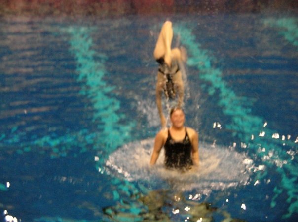
Because Amy had said that she wanted to see some pictures from my synchronized swimming I have included some.

Final Project Critique (Drawing III 2)

For the critique for our final project, we had a professor come and talk to us in the gallery as a guest about our pieces. This seemed to be very helpful to get another professors opinion and hear what he thought about them. For my piece, he was really interested in the synchronized swimming. he said that it was a really good idea to use water in my work along with the paint to express the feeling of being in the pool and also have the colors of the paint blend together. He said that that was a really effective way to show the water, and that it really gave the feeling of being in the water and that you could easily tell what the piece was. He said that blue was an easy way to show water. I had tried using other colors such as reds and purples, and greens and teals, also yellows and greens, but nothing else seemed to work because they all just seemed to look like bodily fluids, so that is why I chose to use blue. He also said that having the different pictures placed in a scattered formation looked half hazard. He understood, though, when I explained that it would clash against the piece that was in front of it since those were in rows, and also because it resembled the water, but he said that it might have worked better if it was in a synchronized swimming formation. He agreed that they should not be placed in specific rows. Then he started to suggest to include using elements about a specific routine I was in. However, I feel that this would overcomplicate the piece. But overall I thought it was a very good and helpful critique.

Friday, May 13, 2011

Final Project (Drawing III 2)

For my final project, because everyone said that they liked my last piece so well during the last critique and they said that they wanted me to make more of them, I decided that I should make a lot more of the drawing pieces that I made for the last project and put them up in the show that we are having on Tuesday. The class said that they really liked the fact that there were multiple pictures because it represented going and swimming every day again and again, which I definitely did, but they wanted me to push that element of the piece more since I only put five of them up earlier, so they wanted me to make a lot more of them in order to do this. I'm not sure how many I am going to put up in the show and how I am going to arrange them, but I will set it up and see what looks the best. These are somewhat difficult and time consuming to make, but I will try to make as many as possible before the show. I am really happy with his piece, and even though they are time consuming and difficult to make they are also pretty fun to make so I should enjoy spending time making more of them. I am really excited for the show! I think it will be great! Our title was going to be, "Lick the Beavers" but Amy decided against that so now it is "No Compromise" because no one could compromise on a title. I think it's pretty clever. We are deciding what pieces everyone is going to put up in the show, but I think it will have a lot of good works and a lot of variety in it.

Saturday, April 30, 2011

Third Drawing Critique (Drawing III 2)

I am so pleased with how this critique went! It started off really funny because someone said that it looked like tasty taffy. Then people started saying some really good comments about it. They really liked the title, "Just Keep Swimming" because it was from the movie Finding Nemo and because it went with the story behind the piece and explained it really well. They said that they really liked the colors and how they blended together with the mark making. Someone else said that it looked wet and that it really looked like you were in the water and it gave that feeling of being expressive and being able to move through the water. Going along with the title, they said that they liked how there was multiple pictures as opposed to one large picture because it gave the feeling of repetitiveness and swimming over and over again everyday, but not necessarily doing the same thing every time you swim which as I said earlier was exactly what I wanted to convey. These were all really encouraging comments to hear because I wasn't completely sure of how accurately I accomplished this. Then a lot of people started to ask questions about my experience in synchronized swimming and how to do it. They were really interested in it and I am really glad that these pieces brought up this discussion. Because of the fact that it gave the feeling of repetitiveness, they suggested that it would be cool to have a very large amount of these and put them all over the wall in a grouping instead of only having the five that I put up in a row. They liked how I displayed the ones that I did, but they said that I should make more of them and display them in that way. I am so happy with this critique.

Monday, April 25, 2011

Third Drawing (Drawing III 2)


For this drawing we were instructed to create a drawing that had to do with the idea of place. During class, in order to come up with ideas to use for this piece, we created a thought web chart so that we were able to visually see our thoughts on this subject matter. When we were creating this chart, we were instructed to not think about what we were putting down, but just put the first thought that came to our mind when we thought about place, and then feed off of those ideas. As I looked over the chart that I created, I notice that there was a recurring theme of nostalgia that was involved in everything that I thought of when it came to place. Everything that I thought of that had to do with place made me think of different memories that I had experienced that had to do with the specific places that I thought of. I also was forced to think about what places were important to me. When I thought about this, I realized that the more time I spent in a certain place, the more meaningful it was to me. Because of this, someone asked me what the most meaningful place to me was and I told them that my home was the most meaningful place to me because I have spent the most time there. I have lived in the same city in the same house for my entire life so I have many good and not so good memories from there. They then asked me to be more specific about what my favorite place at home is to me, and after thinking about it, I realized that the most meaningful place was the pool. The pool is one of my favorite places to be. I have always loved to be in the water ever since I was a very little kid. Whenever I am in the pool I always get this sense of happiness, as strange as that sounds. During high school I was on the synchronized swimming team. This had a major impact on my life, and was the most memorable experience for me throughout my life at home. So I decided to include this in my piece. I wasn't sure how to show this through a drawing because I figured that drawing a synchronized swimmer would be way too cliche. So after looking through some images, I found one that used ink to show the feeling of being in the water. I decided to play around with this idea and experiment with using ink and water to express the emotion of swimming in the pool. When I thought about the feeling that I get in the pool that I would need to convey with this drawing, I realized that I need to convey the happiness, and the feeling of being very free and being able to just flow threw the water. I did not know which type of ink to use at first, but after lots of experimentation I discovered that acrylic paint gave the effect that I wanted for this piece. In my opinion, it is such an amazing feeling to be in the water. In order to create this, I used water to let the ink go wherever the water wanted it to because that would create the feeling of freeness that you get when you are in the pool. I also used cool colors because it is a very cool feeling to be surrounded by the water. It is so refreshing. And I tried not to use too many brushstrokes with this piece, because that would take away from the feeling of being able to do whatever you want to do and not having any confines. And if I did use any brushstrokes I tried to keep them very loose in order to give it that expressive nature. I decided to do a triptych with this piece because only having one small drawing was not enough to express this feeling. You have a new and different experience every time you get in the water, so I figured that doing multiple pictures would accurately express this. That being said, many different people have different opinions on what they feel when they are in the water. Some absolutely love it, and some are scared by it, and some just don't like it at all. So this piece is just what it means to me to be in the water, and for other people it could be something else that they just absolutely love to do. I think that these drawings accurately express what I wanted them too. It took a lot of trials in order to come up with them, but overall I am pretty pleased with the final product.

Third Drawing (Drawing III 2)


This drawing has to do with the idea of place. During class, in order to come up with an idea for this piece, we created a thought web chart so that we could visually see our thoughts on this subject matter. When we were creating this chart, we were instructed to not think about what we were putting down, but just put the first thought that comes to our mind, and then feed off of those ideas. As I looked over the chart that I created, I notice that there was a recurring theme of nostalgia involved in everything that I thought of. Because of this, someone asked me what the most meaningful place was and I told them that my home was the most meaningful place to me because I have spent the most time there. I have lived in the same city in the same house for my entire life. They then asked me to be more specific about what my favorite place at home is to be, and after thinking about it, I realized that it was the pool. I have always loved to be in the water ever since I was a very little kid. During high school I was on the synchronized swimming team. This had a major impact on my life, and was the most memorable experience for me throughout my life at home. So I decided to include this in my piece. I wasn't sure how to show this through a drawing because I figured that drawing a synchronized swimmer would be way too cliche. So after looking through some images, I found one that used ink to show the feeling of being in the water. I decided to play around with this idea and experiment with using ink and water to express the emotion of swimming in the pool. We will see how this turns out!

Tuesday, April 12, 2011

Second Project Critique (Drawing III 2)


For the critique on my second drawing, I felt that that one went very well as well. I worked very hard on this drawing, and I got some good compliments on it, and it was very nice to hear those since I put so much effort into it, and I also got some more constructive criticism on this piece as well. They really liked the drawing as a whole, and they considered it to be a mural art. This took me by surprise because that was not necessarily my intention, but I liked the idea of making a mural that makes a very big and bold statement. They said that this piece definitely expressed the meaning and viewpoint behind it, so making a mural of it made a lot of sense. They talked about how it was a bit of a cross between realism and abstract, which was read as being somewhat confusing, so I am either going to try and render it more to be more realistic like Sam Durant’s work, or take away some of the rendering I have already done to make it more cartoony. They compared it to Frida Khalo’s work. I can definitely see how that is the case and it can be confusing because as I was working on the drawing I was still undecided as to whether or not I wanted it to be realistic, and I was leaning more towards realistic, but I was not finished with the rendering yet, so I think I’m going to go back and finish that. Nothing was said about the background, but I suppose that is a good thing because it is not meant to be a prominent part of the piece so it was not mean to be that noticeable. They said that everything else looked good though so for the most part I am pleased with this piece. I think all of my hard work really helped.

Second Project (Drawing III 2)


For this project, we were instructed to create a drawing that includes the theme of protesting specifically relating to the protests that are currently happening in Madison on the bill that governor Walker is attempting to pass. Originally, I wanted this drawing to reflect my views on this issue and have the drawing be able to clearly convey them, but after starting the drawing, I quickly realized that I did not really know exactly what my views on this issue were. I didn’t really know enough about what all was included in the bill and what it was actually about to form an educated opinion on it and to decide if I supported it or not. So I tried to come up with a drawing that would be fairly neutral in order to remain unbiased about the bill since I didn’t really understand it and instead convey exactly what it is that is happening in this situation as a result of the bill and depict a protest in an impartial way.

In class, we learned about Sam Durant’s work. In his work, he takes photographs from protests and recreates them by drawing them photo realistically. When I heard about him I immediately knew that this was what I wanted to do as well. The reason that I wanted to do this is because I have always loved using photographs and drawing them realistically. I like it so much because of the fact that I find that it is a really good challenge for me. I also thought that this would be a good way to remain neutral and to just convey the situation that is occurring instead of picking a side on the issue. It was hard to find a picture that I wanted to use to do this because I wanted to try and find a close up picture of a face of a protestor at a rally and recreate that, but I did not find any pictures that were close up. I found a couple of options that I thought would work and picked the best.

The reason why I picked this picture was because I saw the look on the faces of the children in the picture and they looked so sad. It really captured my attention to see this because the emotion that the kids gave really explained exactly how people who were protesting were really feeling about this bill, so I thought that that would be a good way to depict exactly what is happening in this situation. Also, the fact that there are kids protesting about this bill in general means that it really does affect everyone so that really stuck me as surprising to see that.

Although I had a lot of fun and really enjoyed doing it, it was a very long and hard process to draw this image. It was a bigger scale than I had ever done before so it took a long time in order to get everything rendered and I ran out of time to finish it, but I think it works to not have everything be completely rendered. It was not what I was going for necessarily, but gives it more of a feel of bring a mural, and I really like the idea of having it represent a mural that actually has a strong meaning behind it. I am going to try and go back and make it all uniform though by either undoing some of the rendering that I did already or by finishing the rendering of the things that I haven’t rendered yet. I am leaning more towards finishing the rendering because I really enjoy doing that and that was my original plan.

Overall, though, I am very happy about how this drawing turned out. I worked very hard on it and spent a lot of time on it, and I think it paid off. I really enjoy the size of it and I enjoy how it was drawn and the fact that there is such a great meaning behind it. It is a good memory of what happened at this point in my life because this situation could potentially impact me for the rest of my life.

Thursday, March 31, 2011

First critique (Drawing III 2)


I thought that the critique for my first project this semester went a lot better than I was expecting it to. The group gave a lot of helpful information and constructive criticism about my piece, which was very good because I knew that I was not happy with my piece overall, but I did not know what I should change about it in order to make the piece better. The class said that they liked the title, and they liked the idea of having maps represent the places in someone's life that are important to them and conveying this by creating a collage of maps. However, they said that since the size of the piece resembled the actual size of a map, they would have liked it to be a smaller size. This surprised me a lot because I specifically made the drawing that big so that it would resemble an actual map and have the person be more life-like because it would be life-sized and therefore it would make it more realistic so that the viewer would be able to relate to her. They also said that the person looked slightly creepy, which I understood and agreed with, but that was a result of not knowing how to work with the material easily since it was my first time using maps to create a self-portrait and it was a very difficult material to work with. They also liked how the eyes were a very prominent part of the picture and draw your attention immediately, but the way that they were done added to the creepiness of the person in the picture. But, overall this critique gave me a lot of good information about how to improve my piece and things that I should do differently if I were to do this piece again.

Friday, February 25, 2011

Map Drawing (2)


For this piece, I wanted to create a self portrait using pieces from maps of places that are important to me. The reason that I wanted to do this is because I wanted the piece to depict how people are strongly influenced and affected by the places that they are involved with in their life.

In order to accomplish this, I used many, many maps and put small pieces of them in a collage in order to make up a picture of myself. I got this idea from the artist Matthew Cusick, who, when doing his own work, takes many, many maps and puts them together in a collage in order to create a certain image. He has a wide range of subject matter including scenery such as waves or highways and portraits and close ups of people. But I chose to do a portrait of myself because I have rarely done this in the past and I have always had a great love of doing portraiture. The pieces that Matthew Cusik created that captivated me the most were the ones that he did of people’s faces. When I first saw his work, I was in awe of it.The way that he included such intricate detail in these pieces was very inspiring to me. It was amazing how he could use such a difficult material to work with and make it look so beautiful. It was also such a special and imaginative idea. It was very original and I had never seen anything like it before. So that is why I chose to do this project. It was a good way to step out of my comfort zone and try something new.

Another artist that I emulated was Alighiero e Boetti. The way that I emulated this artist was because he also used maps in his artwork by creating a collage. Although, he had a different subject matter as well because he created large maps using flags of the places that he was mapping and drawing, instead of doing portraiture, but he has the same general concept. His work was interesting to me because the idea of thinking about a map in this way was something that I would have never thought of, so it was very creative and unique in my opinion.

The places that I chose to use in my drawing are many places in Minnesota, Wisconsin, and Iowa. I chose these places because they have had a large impact on my life. The places I chose from Minnesota are Eden Prairie, which is where I have lived my whole life. Also, the Minneapolis and St. Paul area because that is where I would go to spend my free time and hang out with friends before I went to college. I also included the Rochester are in Southern Minnesota because that is where my dad’s side of the family is from so I spent a lot of time there visiting them when I was growing up. And finally, the Duluth Superior area because I have a cabin up there near McGreggor so that is probably my favorite place to go to in Minnesota.

In Wisconsin, I obviously chose to include Menomonie because I go to school and currently live there. I used Green Bay and Oshkosh because I have friends who live there, so I have been there to visit them. I also included Milwaulkee because I took a trip there with a friend to go to a concert. And Warrens, because when I was younger I would go to Jellystone Park which is in Warrens.

Finally, in Iowa, I chose Ames, because my brother went to school there and currently lives and works there. I also chose Iowa City because my sister is attending school there. My mom is from Humbolt and my grandma lives there so I added that. And my aunt and uncles on my mom’s side of the family live in Fort Dodge. So I chose to include that. I also included a little bit of Chicago because I have taken some trips there as well. All of these places have many great memories for me. It is very interesting, because some of them are recent memories that I’m very fond of, and some of them are very distant memories. It is interesting to think about the places that stick out most to you in your life.

This project was extremely difficult for me. The hardest thing about this project was the material and getting it to work the way that I wanted it to. It was difficult to come across good maps that will work for the specific picture that I was using, and to come up with enough of the same kind of map in order to use it for this project. It was also very hard to get so much detail when using such a difficult material.
Overall, it did not turn out at all how I wanted it to. I think that the face looks very scary. The background looks alright, but it still could be a lot better! I am going to try and rework it so that it will look a little better. I am hoping I will be able to do this!!!

Monday, February 7, 2011

Maps are Art?


For this project, we are supposed to create a drawing incorporating a map into it. To figure out what we are doing for out project, we needed to take an actual map and modify it. For the map that I modified, I took a map of Chicago, which is one of my favorite places to go, and I drew around it different things that remind me of Chicago, such as graffiti in the city, the bean, the navy pier, and the Sears tower, in order to get a feel of what it would be like to draw an image on top of the map, and what kind of an effect that would give the drawing. I discovered that because the map behind the image is very prominent, you need to make the image that you draw on top of the map even more prominent so that it stands out and is visible. But I really do like the way that it looks to have the map underneath the drawing. The reason I like the way it looks is because I believe that a map in itself is a drawing, so drawing the image on top of the map gives it a very interesting effect.


I was looking through images that other people have done that have to do with maps being art, and I came across an artist by the name of Matthew Cusick, who takes many, many maps and puts them together in a collage in order to create a certain image. Specifically, the faces that he creates are so intriguing. They are very realistic considering the fact that they were made out of maps. It inspired me to look at these drawings, so I am considering doing something like that for my final drawing, even though it will be very meticulous and take a very long time to do. I think it will be fun to do and if I am able to do it correctly it will turn out really cool.

Tuesday, January 25, 2011

First Blog Post (2)

My name is Jenna Rieder. I'm from Eden Prairie, Minnesota, and I'm a junior here at UW-Stout in the Studio Art program with a minor in psychology. I am concentrating in drawing so this will be my second time of many taking this class. After I graduate, I plan on going to grad school to become an art therapist. I love to draw; even though I don't think I'm very good at it. I have loved to draw ever since I was little. The main thing that I like to draw is people. Most people consider this to be a very difficult subject to draw, but that is part of the reason why I like it. I like the challenge it presents. However, I would consider other things to be much more difficult to draw than people. When I draw people I aim to create photorealism, however, I have never been satisfied with my attempts at this, so that is my goal whenever I do a drawing. Most people say that they can draw photo-realistically, but they like to challenge themselves to create something different than what they see, but for me, the challenge is to recreate what I see exactly how it is. That being said, when I took Drawing III last semester I learned that the most important part of a drawing is not how realistically you are able to depict your subject, but the emotion that is created by the way that you depict it and the meaning behind the entire piece. So my goal for this semester is to learn how to do that more efficiently. I really hope that I am able to accomplish this semester.