Tuesday, May 17, 2011

Synchronized Swimming


Because Amy had said that she wanted to see some pictures from my synchronized swimming I have included some.

Final Project Critique (Drawing III 2)

For the critique for our final project, we had a professor come and talk to us in the gallery as a guest about our pieces. This seemed to be very helpful to get another professors opinion and hear what he thought about them. For my piece, he was really interested in the synchronized swimming. he said that it was a really good idea to use water in my work along with the paint to express the feeling of being in the pool and also have the colors of the paint blend together. He said that that was a really effective way to show the water, and that it really gave the feeling of being in the water and that you could easily tell what the piece was. He said that blue was an easy way to show water. I had tried using other colors such as reds and purples, and greens and teals, also yellows and greens, but nothing else seemed to work because they all just seemed to look like bodily fluids, so that is why I chose to use blue. He also said that having the different pictures placed in a scattered formation looked half hazard. He understood, though, when I explained that it would clash against the piece that was in front of it since those were in rows, and also because it resembled the water, but he said that it might have worked better if it was in a synchronized swimming formation. He agreed that they should not be placed in specific rows. Then he started to suggest to include using elements about a specific routine I was in. However, I feel that this would overcomplicate the piece. But overall I thought it was a very good and helpful critique.

Friday, May 13, 2011

Final Project (Drawing III 2)

For my final project, because everyone said that they liked my last piece so well during the last critique and they said that they wanted me to make more of them, I decided that I should make a lot more of the drawing pieces that I made for the last project and put them up in the show that we are having on Tuesday. The class said that they really liked the fact that there were multiple pictures because it represented going and swimming every day again and again, which I definitely did, but they wanted me to push that element of the piece more since I only put five of them up earlier, so they wanted me to make a lot more of them in order to do this. I'm not sure how many I am going to put up in the show and how I am going to arrange them, but I will set it up and see what looks the best. These are somewhat difficult and time consuming to make, but I will try to make as many as possible before the show. I am really happy with his piece, and even though they are time consuming and difficult to make they are also pretty fun to make so I should enjoy spending time making more of them. I am really excited for the show! I think it will be great! Our title was going to be, "Lick the Beavers" but Amy decided against that so now it is "No Compromise" because no one could compromise on a title. I think it's pretty clever. We are deciding what pieces everyone is going to put up in the show, but I think it will have a lot of good works and a lot of variety in it.

Saturday, April 30, 2011

Third Drawing Critique (Drawing III 2)

I am so pleased with how this critique went! It started off really funny because someone said that it looked like tasty taffy. Then people started saying some really good comments about it. They really liked the title, "Just Keep Swimming" because it was from the movie Finding Nemo and because it went with the story behind the piece and explained it really well. They said that they really liked the colors and how they blended together with the mark making. Someone else said that it looked wet and that it really looked like you were in the water and it gave that feeling of being expressive and being able to move through the water. Going along with the title, they said that they liked how there was multiple pictures as opposed to one large picture because it gave the feeling of repetitiveness and swimming over and over again everyday, but not necessarily doing the same thing every time you swim which as I said earlier was exactly what I wanted to convey. These were all really encouraging comments to hear because I wasn't completely sure of how accurately I accomplished this. Then a lot of people started to ask questions about my experience in synchronized swimming and how to do it. They were really interested in it and I am really glad that these pieces brought up this discussion. Because of the fact that it gave the feeling of repetitiveness, they suggested that it would be cool to have a very large amount of these and put them all over the wall in a grouping instead of only having the five that I put up in a row. They liked how I displayed the ones that I did, but they said that I should make more of them and display them in that way. I am so happy with this critique.

Monday, April 25, 2011

Third Drawing (Drawing III 2)


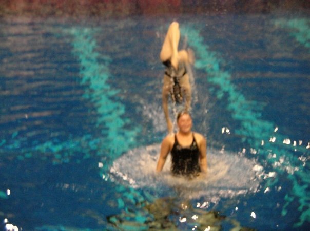
For this drawing we were instructed to create a drawing that had to do with the idea of place. During class, in order to come up with ideas to use for this piece, we created a thought web chart so that we were able to visually see our thoughts on this subject matter. When we were creating this chart, we were instructed to not think about what we were putting down, but just put the first thought that came to our mind when we thought about place, and then feed off of those ideas. As I looked over the chart that I created, I notice that there was a recurring theme of nostalgia that was involved in everything that I thought of when it came to place. Everything that I thought of that had to do with place made me think of different memories that I had experienced that had to do with the specific places that I thought of. I also was forced to think about what places were important to me. When I thought about this, I realized that the more time I spent in a certain place, the more meaningful it was to me. Because of this, someone asked me what the most meaningful place to me was and I told them that my home was the most meaningful place to me because I have spent the most time there. I have lived in the same city in the same house for my entire life so I have many good and not so good memories from there. They then asked me to be more specific about what my favorite place at home is to me, and after thinking about it, I realized that the most meaningful place was the pool. The pool is one of my favorite places to be. I have always loved to be in the water ever since I was a very little kid. Whenever I am in the pool I always get this sense of happiness, as strange as that sounds. During high school I was on the synchronized swimming team. This had a major impact on my life, and was the most memorable experience for me throughout my life at home. So I decided to include this in my piece. I wasn't sure how to show this through a drawing because I figured that drawing a synchronized swimmer would be way too cliche. So after looking through some images, I found one that used ink to show the feeling of being in the water. I decided to play around with this idea and experiment with using ink and water to express the emotion of swimming in the pool. When I thought about the feeling that I get in the pool that I would need to convey with this drawing, I realized that I need to convey the happiness, and the feeling of being very free and being able to just flow threw the water. I did not know which type of ink to use at first, but after lots of experimentation I discovered that acrylic paint gave the effect that I wanted for this piece. In my opinion, it is such an amazing feeling to be in the water. In order to create this, I used water to let the ink go wherever the water wanted it to because that would create the feeling of freeness that you get when you are in the pool. I also used cool colors because it is a very cool feeling to be surrounded by the water. It is so refreshing. And I tried not to use too many brushstrokes with this piece, because that would take away from the feeling of being able to do whatever you want to do and not having any confines. And if I did use any brushstrokes I tried to keep them very loose in order to give it that expressive nature. I decided to do a triptych with this piece because only having one small drawing was not enough to express this feeling. You have a new and different experience every time you get in the water, so I figured that doing multiple pictures would accurately express this. That being said, many different people have different opinions on what they feel when they are in the water. Some absolutely love it, and some are scared by it, and some just don't like it at all. So this piece is just what it means to me to be in the water, and for other people it could be something else that they just absolutely love to do. I think that these drawings accurately express what I wanted them too. It took a lot of trials in order to come up with them, but overall I am pretty pleased with the final product.

Third Drawing (Drawing III 2)


This drawing has to do with the idea of place. During class, in order to come up with an idea for this piece, we created a thought web chart so that we could visually see our thoughts on this subject matter. When we were creating this chart, we were instructed to not think about what we were putting down, but just put the first thought that comes to our mind, and then feed off of those ideas. As I looked over the chart that I created, I notice that there was a recurring theme of nostalgia involved in everything that I thought of. Because of this, someone asked me what the most meaningful place was and I told them that my home was the most meaningful place to me because I have spent the most time there. I have lived in the same city in the same house for my entire life. They then asked me to be more specific about what my favorite place at home is to be, and after thinking about it, I realized that it was the pool. I have always loved to be in the water ever since I was a very little kid. During high school I was on the synchronized swimming team. This had a major impact on my life, and was the most memorable experience for me throughout my life at home. So I decided to include this in my piece. I wasn't sure how to show this through a drawing because I figured that drawing a synchronized swimmer would be way too cliche. So after looking through some images, I found one that used ink to show the feeling of being in the water. I decided to play around with this idea and experiment with using ink and water to express the emotion of swimming in the pool. We will see how this turns out!

Tuesday, April 12, 2011

Second Project Critique (Drawing III 2)


For the critique on my second drawing, I felt that that one went very well as well. I worked very hard on this drawing, and I got some good compliments on it, and it was very nice to hear those since I put so much effort into it, and I also got some more constructive criticism on this piece as well. They really liked the drawing as a whole, and they considered it to be a mural art. This took me by surprise because that was not necessarily my intention, but I liked the idea of making a mural that makes a very big and bold statement. They said that this piece definitely expressed the meaning and viewpoint behind it, so making a mural of it made a lot of sense. They talked about how it was a bit of a cross between realism and abstract, which was read as being somewhat confusing, so I am either going to try and render it more to be more realistic like Sam Durant’s work, or take away some of the rendering I have already done to make it more cartoony. They compared it to Frida Khalo’s work. I can definitely see how that is the case and it can be confusing because as I was working on the drawing I was still undecided as to whether or not I wanted it to be realistic, and I was leaning more towards realistic, but I was not finished with the rendering yet, so I think I’m going to go back and finish that. Nothing was said about the background, but I suppose that is a good thing because it is not meant to be a prominent part of the piece so it was not mean to be that noticeable. They said that everything else looked good though so for the most part I am pleased with this piece. I think all of my hard work really helped.